COPE 378 – Vancouver
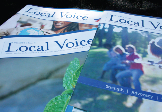
Graphic design for the COPE 378 quarterly magazine publication. Four times a year, we work closely with the editor and oversee proofing of articles, design and layout, proofing to final press check. A 24-page full colour magazine, the content consists of relevant issues and interesting articles pertaining to current events in the union.
This organization reaches their members with invigorating stories, achievements and events.
In 2010, after using the same design for 3 years, Cope 378 came to Dansk Design Group to create a new, modern look for the magazine. Though the type of stories and images would not change greatly, they had outdated fonts, image treatments and colour palettes that need a modern and fresh feel.
The magazine design now has subtle, rich colours instead of bright primaries. The font is very easy to read and a great font for press. In addition, this new font has a thinner line-weight which yields more white space throughout the publication. Headlines are set at the top of pages in a white reverse colour bar. Subtle hairlines appear throughout, connecting large high resolution images with their captions and call-outs.
A new logo for the publication, masthead and design layout for the cover stylistically give the viewer a taste of what they will find inside.

