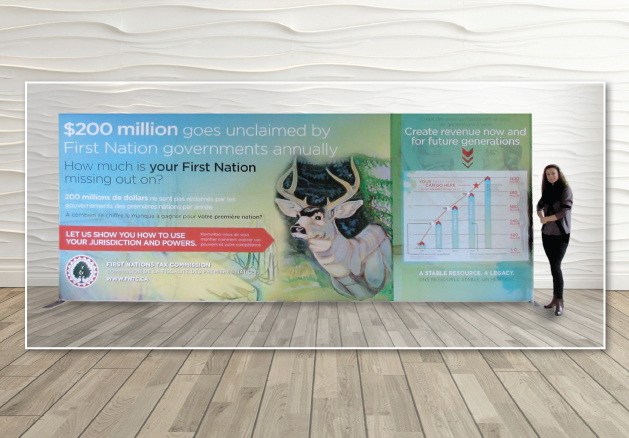
A multi-piece trade show display for the First Nations Tax Commission. A stunning 18′ backdrop display, incorporating original native artwork, sets the stage for this trade show booth. It is a light weight trade show solution, with two accompanying roll-ups, a podium and printed handouts.
Rebranding a 64+ company
The branding and overall design elements are simple and clean. The website is user-friendly and easy to navigate.
[button size=”medium” color=”red” link=”http://www.iphltd.com/” target=”_blank”]View Website [/button]
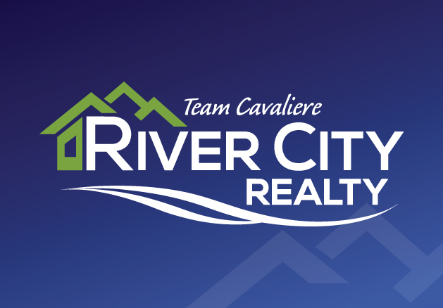
Brand Re-Fresh for River City Realty
The original logo had stood up well for the time it was used, but client was wanting a new fresh look. They liked the design elements in the logo which included the house and water. They also liked the green and blue.
We made the logomark stronger and more blocky, so from far away the logo was clearly seen.
The font was also changed. We went from a serif font to a sans serif font. Again – legibility from far away was a concern here.
The whole project saw the completion of the logo and rebranding, as well as letterhead design, bus bench signage and initial website design.
Branding & Marketing Materials
The original ‘P’ logo for Platinum Realty was created in 2004, which is still used today. A sharp black box is inset with metallic silver hairlines. Two ‘P’s intersect, creating a link; with the full company name in a traditional serif font called Mrs. Eaves, set below.
The branding from day one was to be ‘clean, classy and modern’, and to ‘be set apart from other realty companies’ in the area. It is imperative the branding of the company be seamless, from first contact to successful sale, and all of the other steps in between.
Lawn Signs dot houses and properties for sale; 8’x4′ signs can be found along highways from Shuswap, Sun Peaks, Barriere and Clearwater; letters, envelopes, business cards and correspondence carried with agents.

Condominium Project in Downtown Kamloops
Mosaic is a gorgeous red brick and glass, modern condominium building built in downtown Kamloops, on 5th Avenue and Battle.
This was a great project, as Communication Solutions was brought in from the ground floor and helped come up with the name, branding, sales kits, print material and website. It resulted in branding that fit the physical classiness of the actual building, built by A&T Project Developments.
The colours chosen for the logo were burgundy red and metallic grey. In addition to this colour palette, which could easily be interchanged with the logo were cyan blue and moss green.
Sales kits and brochures took advantage of this metallic silver in the colour scheme, and we incorporated a printed metallic sheen into the ink of the pieces. The images chosen reflect the target audience of these units – young corporates, that exude upscale lifestyle and urban appeal.
Throughout the website, are interactive components throughout. For example, on the floor plans views, a user will scroll to one of the four floors of the building to choose the floor they are interested in, then scroll over which unit on the floor to preview the layout and floor plan. Downloadable floor plans and price lists are linked through pdfs.
This is a Communication Solutions client and project. Go to www.solutiongroup.ca to view their services. Lead designer contracted: Kristina Benson.
Landscaping Branding Refresh
After 7 successful years, it was time for this landscaping company to refresh its image. The concept of the weeping willow stayed in the presence of the new logo. The largest challenge of this project was finding a suitable colour palette to accommodate the existing fleet of teal landscaping trucks. New designs were created for stationary graphics, ads, t-shirts and crea apparel and vehicle graphics.
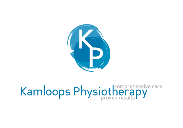
Branding for Kamloops Physiotherapy
This design included logo design, stationery, referral forms and office signage.
The inspiration for this logo design started with the ‘ying-yang’ concept. Incorporating healing calm blue colours as well as the ‘K’ and ‘P’ letters into the logo.
The name and tagline for Kamloops Physiotherapy can be used with or without the logomark. Business cards were printed with a soft faded background, replicating the logo colours, and printed on a crisp glossy white stock.