Landscaping Branding Refresh
After 7 successful years, it was time for this landscaping company to refresh its image. The concept of the weeping willow stayed in the presence of the new logo. The largest challenge of this project was finding a suitable colour palette to accommodate the existing fleet of teal landscaping trucks. New designs were created for stationary graphics, ads, t-shirts and crea apparel and vehicle graphics.
Kamloops Symphony Orchestra – 2011/2012 Season
Warm browns, burgundy reds and subtle oranges are used in this season’s graphics. The main graphic is a free-flowing artistic rendering of music. The pieces in the season promotions include brochure, signage, ads, posters and handbills.
Custom Builder
This award-winning builder’s website design now reflects the modern, architecturally appealing buildings they design. The website features a stunning and simple home page that conveys modern design in both commercial and residential spaces. The use of white hairlines reflect the concept of floor plans. The site is easy to navigate with a large portfolio of image galleries.
This is a Communication Solutions client and project. Go to www.solutiongroup.ca to view their services. Lead designer contracted: Kristina Benson.
[button size=”medium” color=”red” link=”http://aandt.ca/” target=”_blank”]View Website [/button]
Marketing Campaign & Website
River City Dental hired Communication Solutions to come up with a full marketing plan, including ad designs and direct mail, based on their existing branding created.
We helped design the print and web items needed for the custom marketing plan. All printed pieces are part of a cohesive set, including full colour newspaper ads, direct mail piece, postcards, website design, yellow page ads and stickers.
This is a Communication Solutions client and project. Go to www.solutiongroup.ca to view their services. Lead designer contracted: Kristina Benson.
[button size=”medium” color=”red” link=”http://www.rivercitydental.ca/” target=”_blank”]View Website [/button]
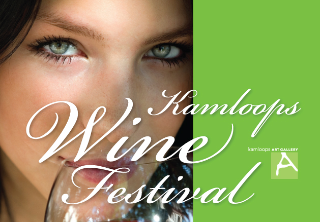
Kamloops Art Gallery: Wine Festival
Designing the creative for the Kamloops Art Gallery has always been one of our most exciting long-term clients. The Wine Festival is a week-long of planned wine-related activities including wine pairings with local participating restaurants – often pairing local fresh ingredients into the meals; as well the main Wine Tasting held at the Kamloops Convention Centre. An event with up to 400 people participating in tasting wines from around the world.
The client allows us to be creative each year to create eye-catching print designs, incorporating and capturing the essence of wine.
Pieces in the fundraiser promotions include 11×17 posters, 22×28 poster, handbills, tickets, table toppers, signage and ads.
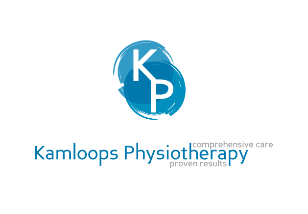
Branding for Kamloops Physiotherapy
This design included logo design, stationery, referral forms and office signage.
The inspiration for this logo design started with the ‘ying-yang’ concept. Incorporating healing calm blue colours as well as the ‘K’ and ‘P’ letters into the logo.
The name and tagline for Kamloops Physiotherapy can be used with or without the logomark. Business cards were printed with a soft faded background, replicating the logo colours, and printed on a crisp glossy white stock.
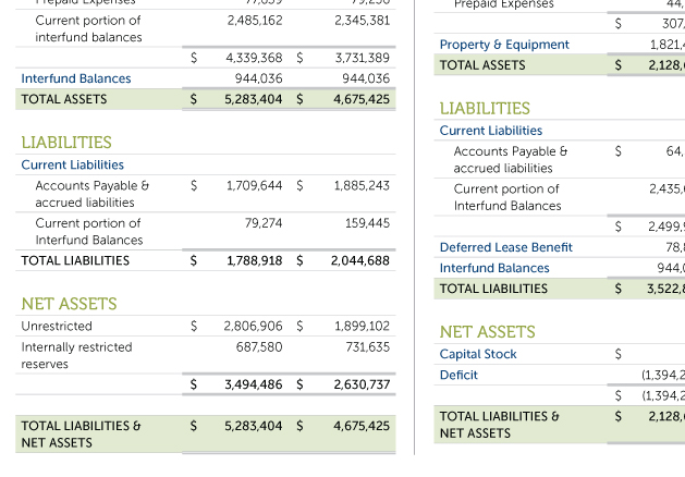
COPE 378 Financial Report
This is the financial report, or annual report, for the Canadian Office and Professional Employees Union. The design uses established design elements based on our redesign of COPE 378 Local Voice magazine. It is a clean layout, presenting the financials in an easy to read design.
Kamloops Art Gallery
The inspiration from this piece was taken from travel itself. With a background of an eastern motif, travel stamp icons are placed throughout. A vibrant purple is off-set with yellow. Promotion pieces include poster, stand-up or roll-up trade show poster, handbills, tickets and other printed items.
The fundraiser is a raffle to win a trip for two on a river cruise along the Danube River.
