Booklets – First Nations


Graphic Design

This lightweight fabric uses Far Infrared Therapy – with an extensive product line for dogs, humans and horses. The Canadian division has a much more modern look and feel that is now incorporated into all package design, product magazines, ads and signage.
The design challenge for this client was taking a lot of images, information, research, testimonials and products and creating a clean and streamlined look.
We divided the products into the respective categories using a colour system of orange, green and blue. This makes it easy for the end user and client to reference. Lifestyle images of people wearing the products are also used throughout. The complementary images showcase the product as well give reference to the types of activities this product can be used for.
The branding and overall design elements are simple and clean. The website is user-friendly and easy to navigate.
[button size=”medium” color=”red” link=”http://www.iphltd.com/” target=”_blank”]View Website [/button]
The original logo had stood up well for the time it was used, but client was wanting a new fresh look. They liked the design elements in the logo which included the house and water. They also liked the green and blue.
We made the logomark stronger and more blocky, so from far away the logo was clearly seen.
The font was also changed. We went from a serif font to a sans serif font. Again – legibility from far away was a concern here.
The whole project saw the completion of the logo and rebranding, as well as letterhead design, bus bench signage and initial website design.
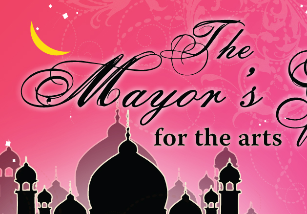
The design created for this event was based on the theme ‘Arabian Nights’. A silhouette of Arabian temples is set against a back drop of stunning pinks and magentas in an evening sky. The graphic design for the Kamloops event includes posters, signage, handbills, tickets, facebook graphics, program cover and ads.
This successful event was jointly hosted by the Kamloops Art Gallery, the Kamloops Symphony Orchestra and Western Canada Theatre.

The original ‘P’ logo for Platinum Realty was created in 2004, which is still used today. A sharp black box is inset with metallic silver hairlines. Two ‘P’s intersect, creating a link; with the full company name in a traditional serif font called Mrs. Eaves, set below.
The branding from day one was to be ‘clean, classy and modern’, and to ‘be set apart from other realty companies’ in the area. It is imperative the branding of the company be seamless, from first contact to successful sale, and all of the other steps in between.
Lawn Signs dot houses and properties for sale; 8’x4′ signs can be found along highways from Shuswap, Sun Peaks, Barriere and Clearwater; letters, envelopes, business cards and correspondence carried with agents.
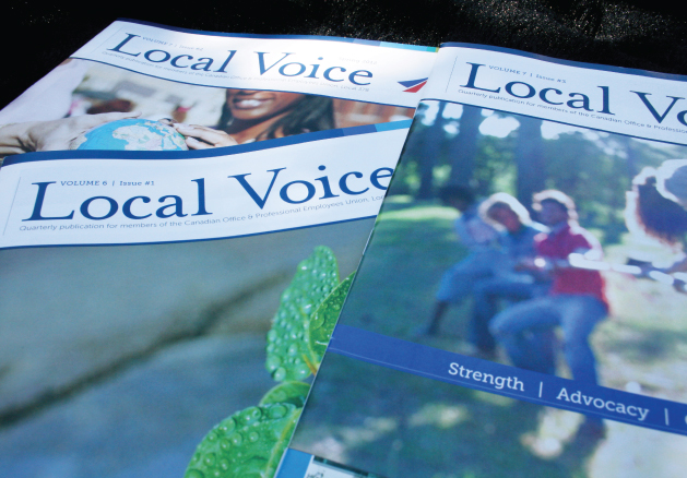
Graphic design for the COPE 378 quarterly magazine publication. Four times a year, we work closely with the editor and oversee proofing of articles, design and layout, proofing to final press check. A 24-page full colour magazine, the content consists of relevant issues and interesting articles pertaining to current events in the union.
This organization reaches their members with invigorating stories, achievements and events.
In 2010, after using the same design for 3 years, Cope 378 came to Dansk Design Group to create a new, modern look for the magazine. Though the type of stories and images would not change greatly, they had outdated fonts, image treatments and colour palettes that need a modern and fresh feel.
The magazine design now has subtle, rich colours instead of bright primaries. The font is very easy to read and a great font for press. In addition, this new font has a thinner line-weight which yields more white space throughout the publication. Headlines are set at the top of pages in a white reverse colour bar. Subtle hairlines appear throughout, connecting large high resolution images with their captions and call-outs.
A new logo for the publication, masthead and design layout for the cover stylistically give the viewer a taste of what they will find inside.
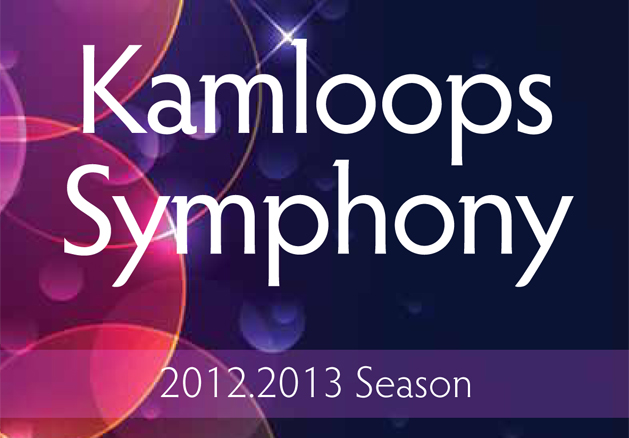
The inspiration for this season was to create a vibrant, exciting, enticing design!
A design that as people see the brochures, posters and ads throughout the city, it propels them to be a part of watching the performances… to ask: “Who is the Symphony, What performances are happening this year, This looks exciting. I want to GO!”
The 16-page full colour brochure has a clean design that features 16 performances and associated performers. Graphic design for the entire year includes ongoing ads, posters and signage.
[Download the full pdf at www.kamloopssymphony.com]
[button size=”medium” color=”red” link=”http://www.kamloopssymphony.com” target=”_blank”]View Actual Downloadable PDF Brochure[/button]

Mosaic is a gorgeous red brick and glass, modern condominium building built in downtown Kamloops, on 5th Avenue and Battle.
This was a great project, as Communication Solutions was brought in from the ground floor and helped come up with the name, branding, sales kits, print material and website. It resulted in branding that fit the physical classiness of the actual building, built by A&T Project Developments.
The colours chosen for the logo were burgundy red and metallic grey. In addition to this colour palette, which could easily be interchanged with the logo were cyan blue and moss green.
Sales kits and brochures took advantage of this metallic silver in the colour scheme, and we incorporated a printed metallic sheen into the ink of the pieces. The images chosen reflect the target audience of these units – young corporates, that exude upscale lifestyle and urban appeal.
Throughout the website, are interactive components throughout. For example, on the floor plans views, a user will scroll to one of the four floors of the building to choose the floor they are interested in, then scroll over which unit on the floor to preview the layout and floor plan. Downloadable floor plans and price lists are linked through pdfs.
This is a Communication Solutions client and project. Go to www.solutiongroup.ca to view their services. Lead designer contracted: Kristina Benson.
These two print pieces showcase the multitude of print capabilities found at Wayside Printers. Printed on various types and thicknesses of paperstock, the stunning graphics creatively incorporate: metallic ink processes, gloss varnish, aqueous coatings, 6-colour printing, variable data and die-cutting. The large piece is 12″x12″ with an inset piece of 6″x6″ and both are printed using off-set and digital techniques. The booklet promo explains the printer capabilities and lists stock types.
The second printed booklet is a 6″x6″ booklet acts as a ‘swatch book’ where quick reference can be made to envelope types, cmyk printing processes, duotones, blacks and rich blacks, stock types and paper weight thicknesses.
Joint project. Lead designer: Kristina Benson. Writer: Kate Stebbings.